Efficient website reporting with Google Analytics Dashboards
Google Analytics is used for more than 54 percent of German websites to measure the success of their online presence (read more). The most important KPI for website use, traffic origin and most popular contents are by default divided into several reports.
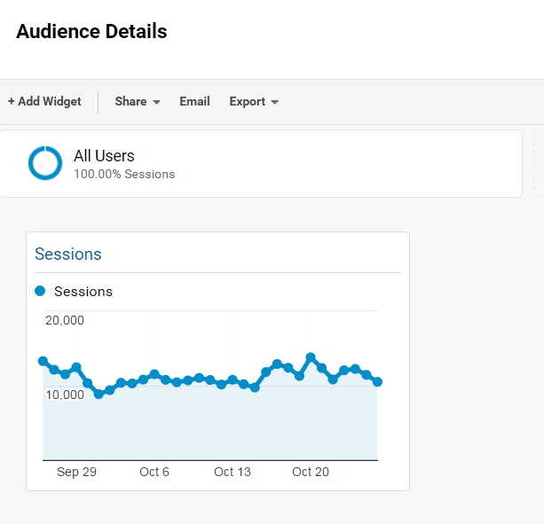
With Dashboards by Google Analytics you can pull the most relevant information together, keep an eye on it almost in real time and send automatically exported reports to a pre-defined mailing list without any manual effort.
You can find them at the top of the left column:
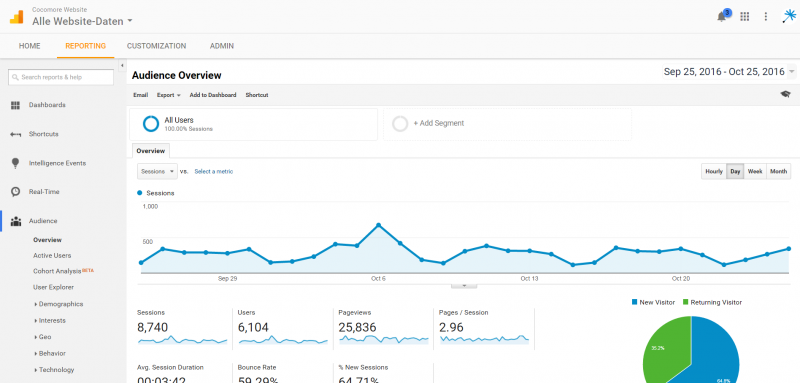
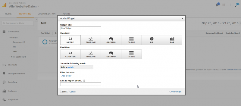
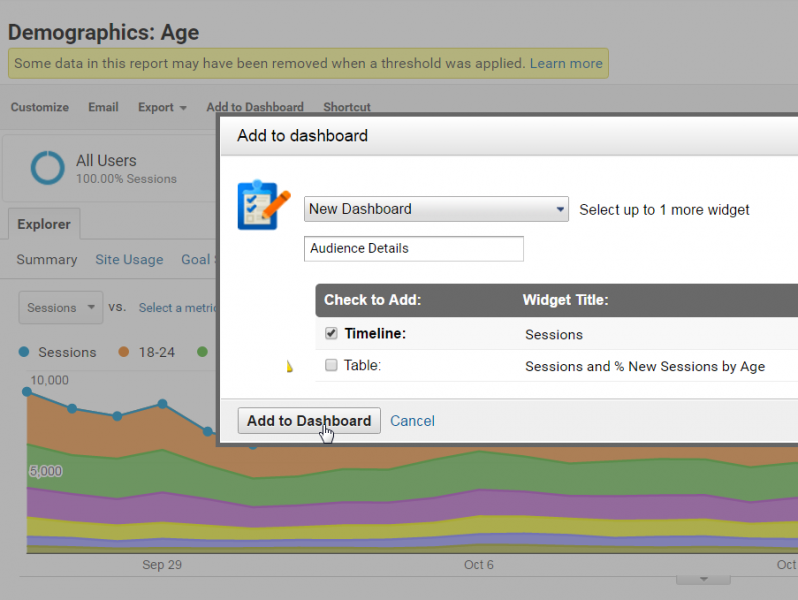
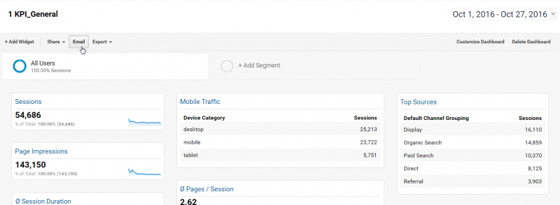
Each dashboard can consist of up to twelve widgets that display data for the currently defined time span analogous to all reports in Google Analytics.
There is no limit to the number of dashboards per view, which means: You can create a “Management Summary Dashboard” with the central KPI, as well as a separate dashboard per relevant channel by topic - e. g. for SEA, SEO, social media campaigns and more for E-Commerce, website activity, engagement etc.
Forms of presentation: timeline or pie chart?
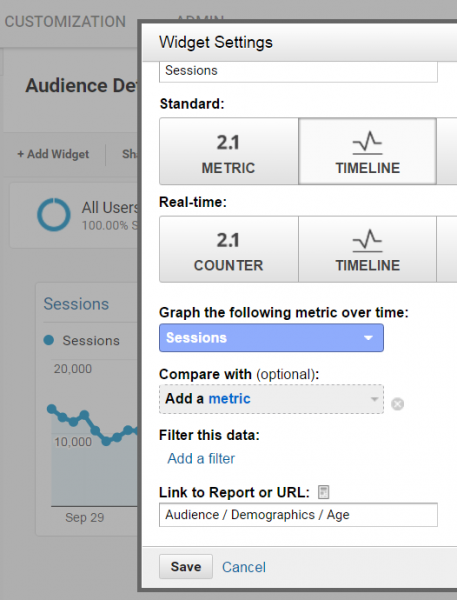
All widgets can be displayed on the dashboard in different ways according to one’s individual needs. The live versions of standard widgets show information in real time or rather for the last 30 minutes.

| Widget | Pro | Con |
|---|---|---|
| Metric |
|
|
| Timeline |
|
|
| Geomap |
|
|
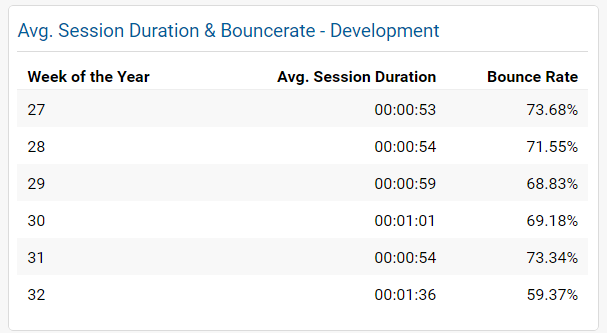
| Table |
|
|
| Pie |
|
|
| Bar |
|
|
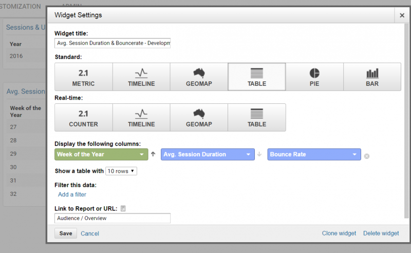
The filter function: Desired relevant data at your fingertips
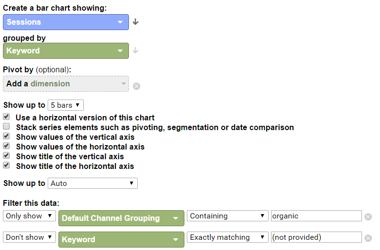
With filters you can limit data in each widget individually according to specific characteristics (independent of the characteristics to be displayed) or exclude it. This makes sense when displaying, for example, the top ten email (but not media) campaigns according to sessions in a table, pie or bar chart. Just select “Sessions” as metric and “Campaign” as dimension and filter the information with “Default Channel Grouping” - exactly matching - Email.
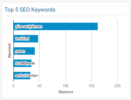
Several filters can be combined as well. Only their overlap will be left, since they are always connected by an “AND” logic. This way, you can display, for instance, the top five traffic drivers among SEO keywords without the “not provided” block:
For „OR“-Logics within the same dimension Regular Expressions are required (see here).
Especially for events or pages very detailed information can be displayed on a dashboard by a clever use of filters. For instance, the top ten most clicked videos on the website, if they are being registered via event tracking, or the five most accessed pages from a navigation point X. Filters with the corresponding event category or the specific page path level are making it possible (you can find them at Behavior/Site Content/Content Drilldown).
Quickly more details via „Link to Report“
The “Link to Report“ function is very useful if the dashboard only serves for an initial impression and (as in most cases) a look at more details or characteristics might be interesting. Here, GA suggests the standard reports via autocomplete, as soon as you start typing into the box.
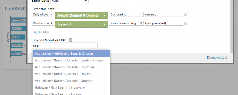
When creating dashboard widgets from an existing standard or customized report, they are automatically stored as a link for the widget.
Different sorting options
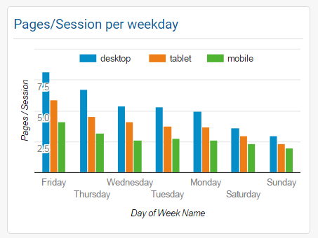
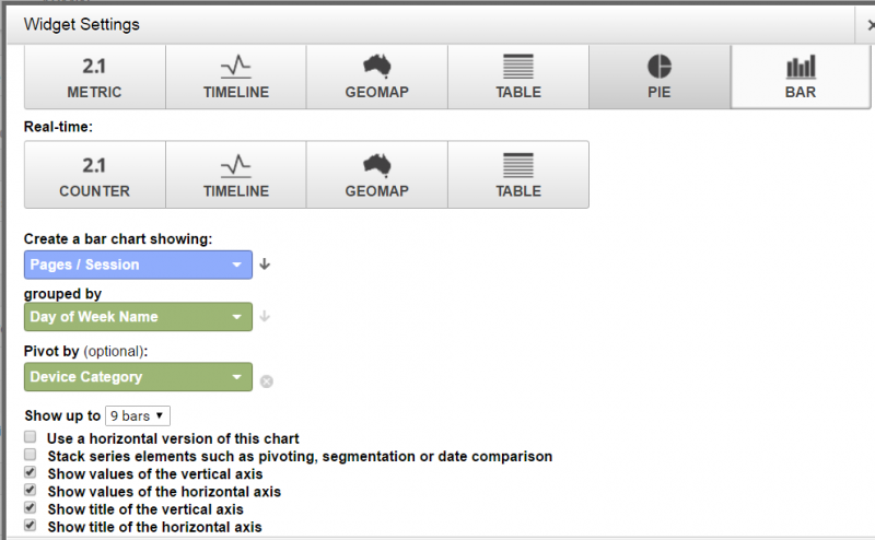
The display of information in the widgets can be sorted by all available dimensions and metrics. By default they are listed in a downward order following the first figure, which can easily be changed by clicking the small arrow next to the boxes.
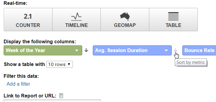
Tip: Even weekdays, months, etc. are possible as a metric. Just select the corresponding numeric values for a chronological order and then sort them in an ascending order.
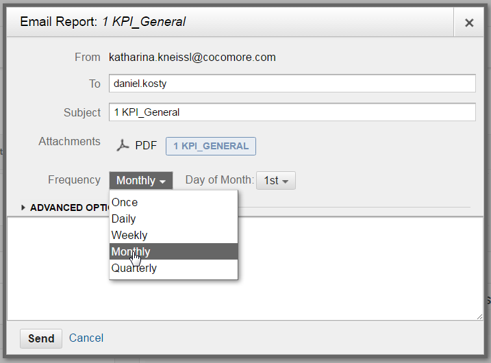
Example with instructions: Setting up automated monthly reports including a comparison to the previous month
Once the dashboard or dashboards are set up, they can easily and on a regular basis be sent out to individual people or a pre-defined mailing list as PDFs.
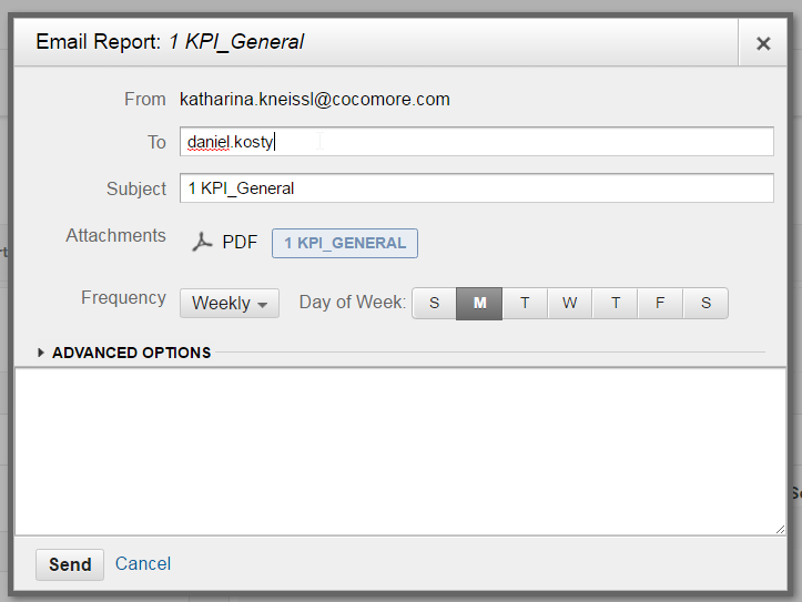
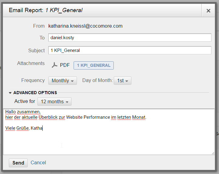
The timing can be specified for the whole year individually, e. g. always on the first of a month – even with a nice message for coworkers, who receive the reports.
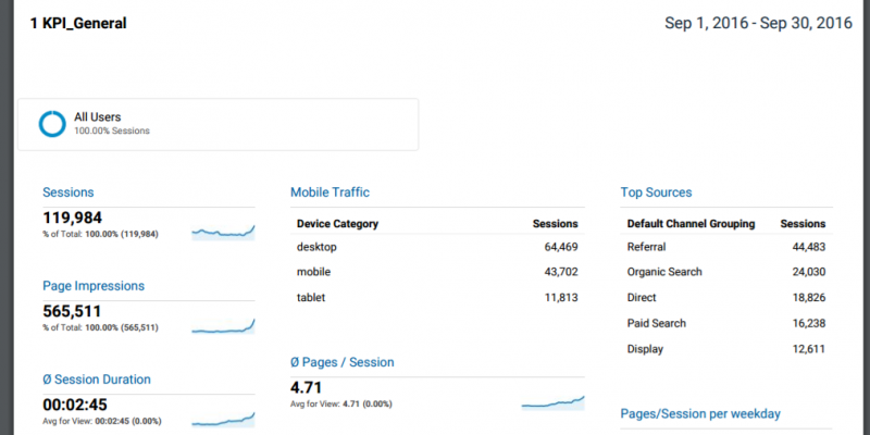
The recipients on the mailing list then get the version of the report, just as it is visible in the “Export PDF” version, delivered straight to their inbox every month.
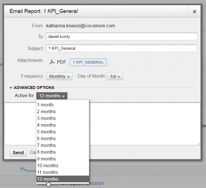
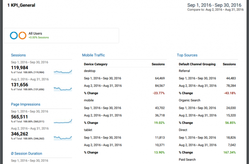
Caution: No matter what the time range has been set to when creating the dashboard, as soon as the report is automatically sent, Google Analytics uses the default time range of the previous 30 days! When sending them manually, the previously set time range is applied.
But not only numbers of the previous month are interesting, the changes compared to the corresponding previous month are as well. This can also be automated.
For this purpose, during the setup of automated forwarding, you have to select the option “Compare to” from “Date Range”.
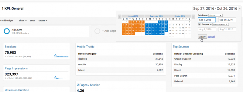
Unfortunately this process can’t be used for a year-on-year for that month, since Google Analytics does not only specify the date range and the default time range of the past 30 days, but also the comparison period as “previous period”, which means the preceding 30 days.
Conclusion: Altogether, the dashboards in Google Analytics are an efficient tool to keep yourself and relevant stakeholders (uncommented) up to date. It can only ever be an impulse though, and doesn't replace a professional website reporting. For interpretations and relevant details about the causes for the displayed developments as well as corresponding recommended action, an individual assessment and commentary from a person are necessary – preferably by an experienced professional.
Our expert

Katharina Kneissl
Any questions or input? Reach out to our experts!
Katharina Kneissl has been working for Cocomore since October 2013. As a consultant she conceptually and analytically supervises client projects. Prior she finished her master studies in media and design management at the university of applied sciences Rhein-Main. Right time, right place, right content – this describes Katharina’s attitude towards a modern customer approach.
Katharina in short: imaginative, dedicated and a fan of black humor.


