CSS media queries and breakpoints are amazing. They allow us to completely change the looks and organization of a wesbsite’s elements based on the size of the device being used. However, sometimes CSS is not enough, and we need to use JavaScript to run some specific logic at a given breakpoint. So probably all frontend developers have done something like this at some point in their life:
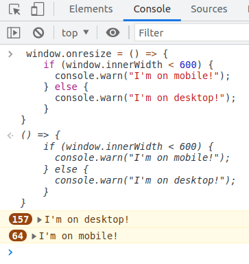
window.onresize = () => {
  if (window.innerWidth < 600) {
    // do mobile layout stuff
  } else {
    // do tablet/desktop layout stuff
  }
}
This might look pretty innocuous, but the issue is that such code will run every single time the viewport changes size, including when rotating the screen's orientation.

You might say "oh, but resizing barely ever happens!". But I would argue that just because something rarely happens doesn't mean you shouldn't prepare and optimise for when it does.
The fact is that we know we have limited resources in the browser, and every little bit of work piles up, so if we can avoid doing it and defer it to when such work is actually needed, we'll ultimately be improving the overall performance of our websites. This is especially true if functions like the one above do some heavy processing or checking or synchronous operations which might cause the layout to reflow, which end up contributing to poor perceived performance by our users.
Is there a better way of doing it?
Why, yes there is! Enter window.matchMedia(). This is a globally-available Window API that returns an object which can be used to determine if the document matches the media query string passed in as an argument. This match can be checked both immediately or via event.
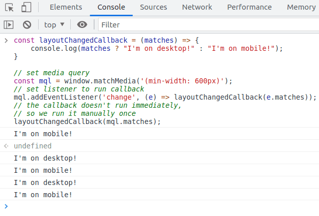
const layoutChangedCallback = (matches) => {
  console.log(matches ? "I'm on desktop!" : "I'm on mobile!");
}

// set media query
const mql = window.matchMedia('(min-width: 600px)');

// set listener to run callback
mql.addEventListener('change', (e) => layoutChangedCallback(e.matches));

// the callback doesn't run immediately, so we run it manually once
layoutChangedCallback(mql.matches);

Just a small caveat...
If you need to support Safari < 14, you must use addListener() instead of addEventListener(). That function is now deprecated on all browsers but it still works, so consider it only if you must support older Safari versions.
In other words...
const mql = window.matchMedia('(min-width: 600px)');

// modern browsers
mql.addEventListener('change', (e) => layoutChangedCallback(e.matches));

// older Safari
mql.addListener((e) => layoutChangedCallback(e.matches));

layoutChangedCallback(mql.matches);
But that's not all!
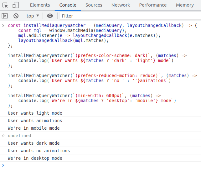
matchMedia() is not just for detecting breakpoints. You can (and should) use it for anything you can detect using CSS media queries! This includes detecting for user preferences, like dark mode or prefers reduced motion.
// a helper function for streamlining the usage of matchMedia
const installMediaQueryWatcher = (mediaQuery, layoutChangedCallback) => {
  const mql = window.matchMedia(mediaQuery);
  mql.addListener(e => layoutChangedCallback(e.matches));
  layoutChangedCallback(mql.matches);
};

installMediaQueryWatcher(`(prefers-color-scheme: dark)`, (matches) =>
  console.log(`User wants ${matches ? 'dark' : 'light'} mode`)
);

installMediaQueryWatcher(`(prefers-reduced-motion: reduce)`, (matches) =>
  console.log(`User wants ${matches ? 'no ' : ''}animations`)
);

installMediaQueryWatcher(`(min-width: 600px)`, (matches) =>
  console.log(`We're in ${matches ? 'desktop': 'mobile'} mode`)
);

So is there a real use case for window.onresize?
Sure there is, but I would argue that only for operations that do require you to know the size of the window at all times, like when you are manually handling the positioning of certain floating elements on a page, for instance. And even if you do, do consider if you should maybe throttle or debounce the calls to such code. And if you need to keep track of the size of something within a page, you're probably better off with ResizeObserver.

